
OVERVIEW
Context
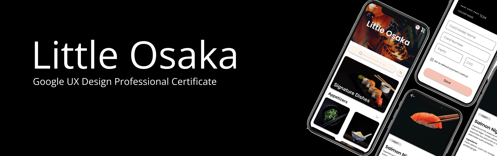
As part of the UX Design Professional Certificate program by Google, I was tasked with developing a mobile app as one of the assigned portfolios. Little Osaka (fiction) is a restaurant located in Montreal, QC whose target customers are young students looking for a taste of Japan in their hometown.
Project Duration
May 2022 - August 2022
The Challenge
How can we help customers easily take orders and turn tables more efficiently?
RESEARCH
Understanding the User
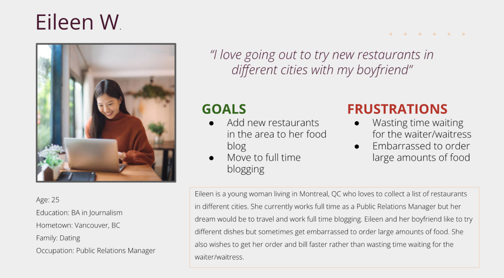
I conducted interviews and created empathy maps to understand the users I’m designing for and their needs. A primary user group identified through research were couples or families who are looking to be open to trying new food together.
Pain Points
1. Time waiting
2. Accessibility of the app - Many platforms for ordering food are not equipped with assistive technology.
3. Lack of new dishes to try - Some users who were new to the restaurant that wanted a traditional Japanese meal could not easily decide what to order after viewing the menu.
2. Accessibility of the app - Many platforms for ordering food are not equipped with assistive technology.
3. Lack of new dishes to try - Some users who were new to the restaurant that wanted a traditional Japanese meal could not easily decide what to order after viewing the menu.
Personas
Eileen W. is a young adult blogger who needs an app to quickly and easily order from a variety of meal options so she can spend less time waiting for the waiter and enjoy the different dishes she tried.
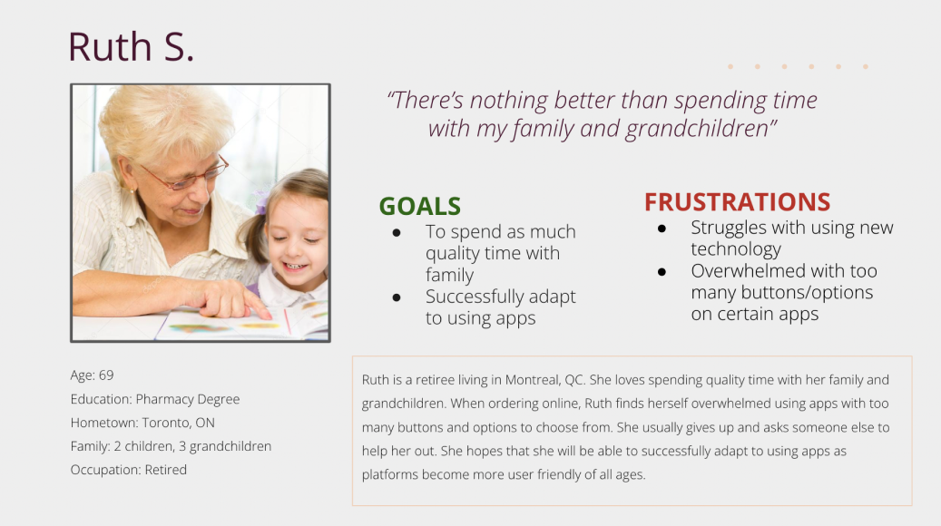
Ruth S. is a retired grandma, not tech-savvy who needs an app with lots of visuals to help her order in a simple and efficient way so she can order food online herself and not appear unable to do so.
Ruth S. is a retired grandma, not tech-savvy who needs an app with lots of visuals to help her order in a simple and efficient way so she can order food online herself and not appear unable to do so.
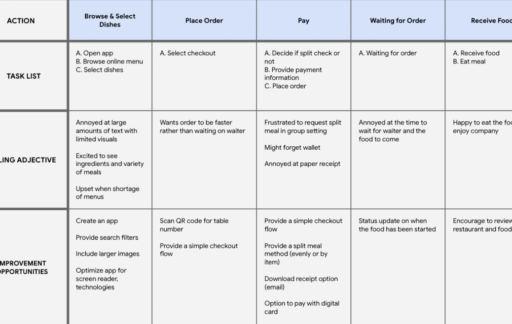
User Journey Map
I created a chart to describe out a user’s journey throughout using the app
Goal Statement
Our ordering app will let users view menu, order, and pay which will affect customers eating at a restaurant by giving them the ability to easily order from a variety of meal options so they can spend less time waiting for the waiter and enjoy different dishes.
We will measure effectiveness by analyzing the time they spend at a table.
We will measure effectiveness by analyzing the time they spend at a table.
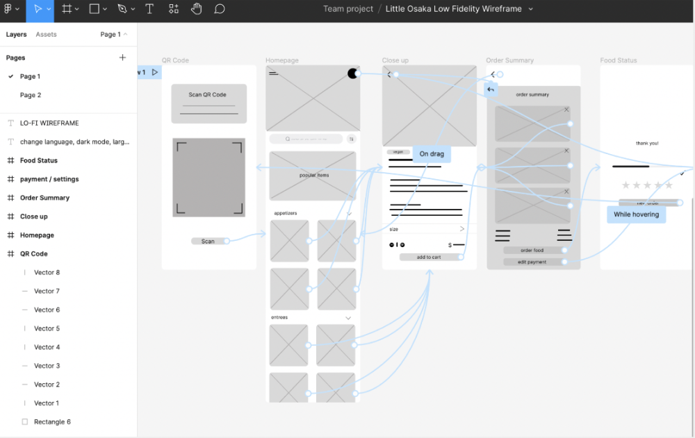
Wireframes
As the initial design phase continued, I made sure to base screen designs on feedback and findings from user research.


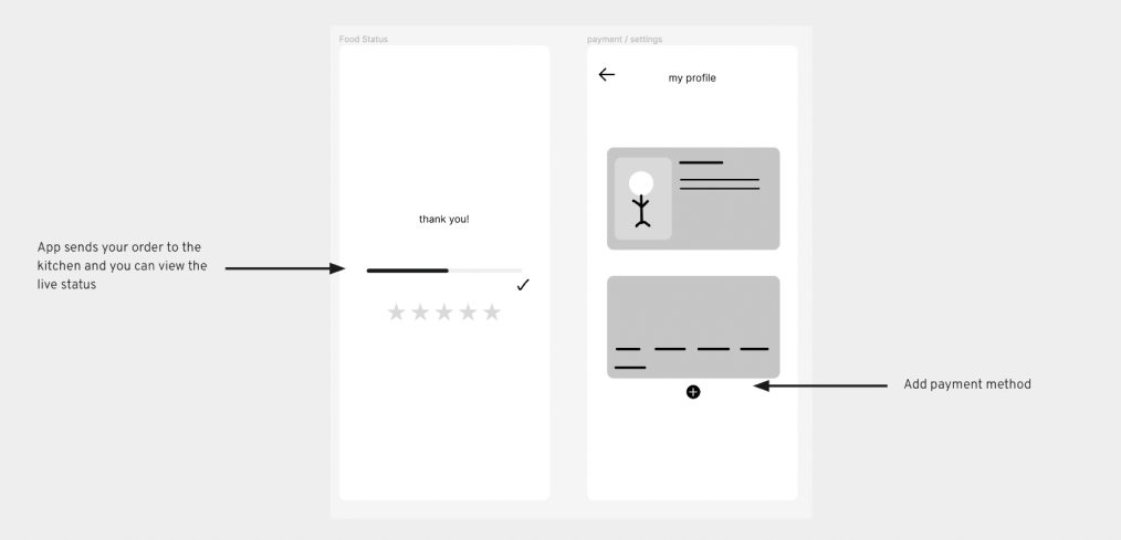
Low-Fidelity Prototype
The low-fidelity prototype connected the primary user flow of ordering off a digital menu.
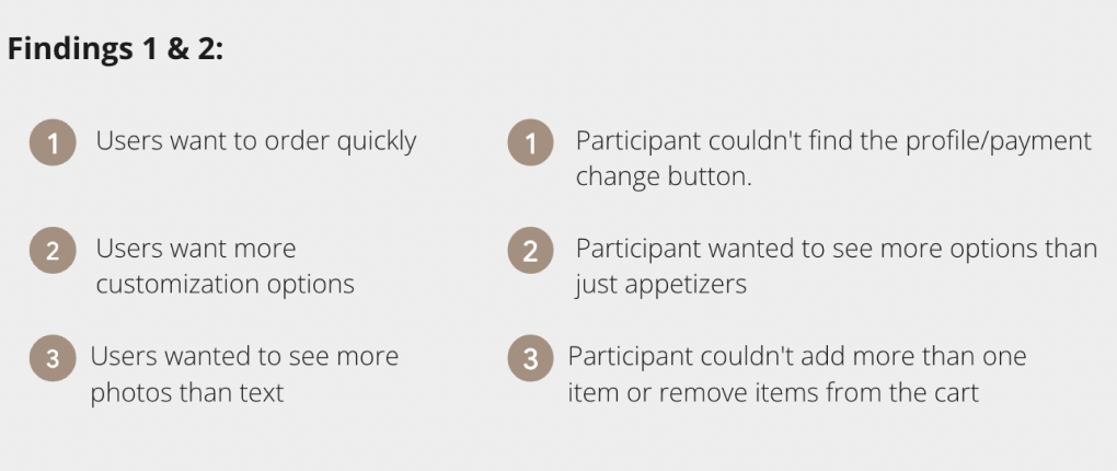
Usability Study Research
I conducted two rounds of usability studies. Findings from the first study helped guide the designs from wireframes to mockups. The second study used a high-fidelity prototype and showed what aspects of the mockups needed refining.

REFINING THE DESIGN
Mockups
Early designs allowed for some customization, however after revision the design had users be able to customize their order and edit their payment method more easily.
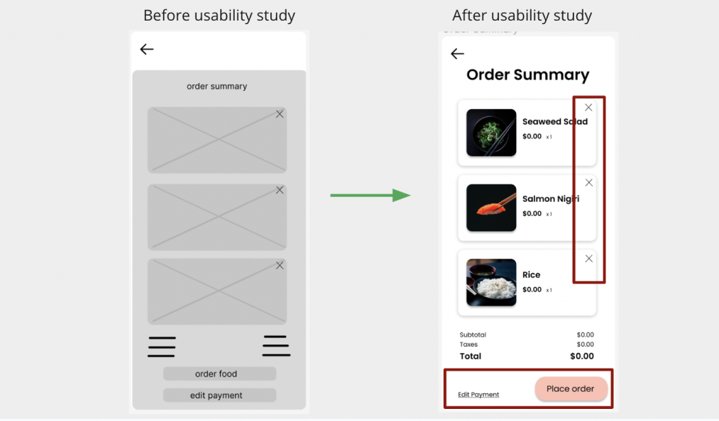
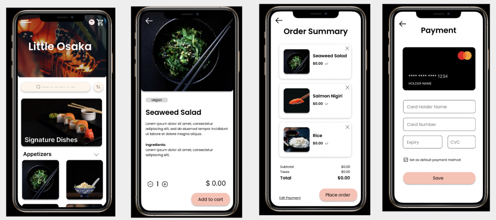
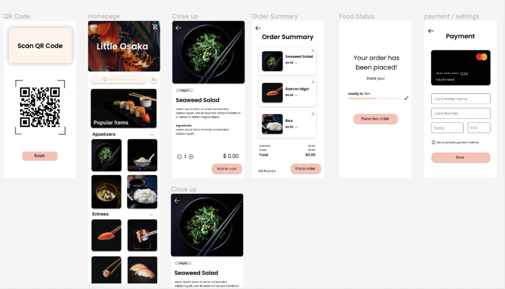
High-Fidelity Prototypes
The final high-fidelity prototype presented cleaner user flows for ordering and checkout. It also meets user needs for customization and editing payment method more smoothly.
GOING FORWARD
Takeaways
During the course, I learned the design process from empathizing with users, define pain points, ideate solutions, create wireframes and prototypes, test all the way to iterating on designs!
Peer feedback:
“I noticed a large difference in the efficiency of viewing and ordering off the menu. I found myself trying new dishes because of the large amounts of imagery. I loved the user friendliness of the app and even took my dietary restrictions into consideration!”
“I noticed a large difference in the efficiency of viewing and ordering off the menu. I found myself trying new dishes because of the large amounts of imagery. I loved the user friendliness of the app and even took my dietary restrictions into consideration!”
Next Steps
1. Conduct another round of usability studies to validate whether the pain points users experienced have been effectively addressed.
2. Conduct a test in the restaurant and compare the findings from before (handheld, word-heavy menus and waiting on waiters), versus after (converting to a digital menu)!
3. Consult with restaurant stakeholders to finalize designs and move project towards the engineering phase.
2. Conduct a test in the restaurant and compare the findings from before (handheld, word-heavy menus and waiting on waiters), versus after (converting to a digital menu)!
3. Consult with restaurant stakeholders to finalize designs and move project towards the engineering phase.